CoxComb Chart - How do you read and make it?

Understanding what is a CoxComb Chart
A Coxcomb chart, also known as a polar area chart or rose diagram, is a type of data visualization that combines aspects of a pie chart and a bar chart. In a Coxcomb chart, each category is represented by a segment (like a slice of pie), but instead of the angle of the slice varying (as in a pie chart), it's the radius (length of the segment) that changes. The area of each segment is proportional to the data it represents. What makes it stand out is that all the segments have the same angular width, allowing for easy comparisons based on the size of the segment's area.
Here’s a simple way to think about it: imagine a flower, where each petal represents a category. As your data changes, the length of each petal grows or shrinks, but the flower’s overall shape remains the same. This can help the audience focus on how different categories compare, making it easier to spot trends or anomalies.

This chart was originally created by Florence Nightingale who used it to visually highlight the shocking reality of the British army’s death toll during the Crimean War.
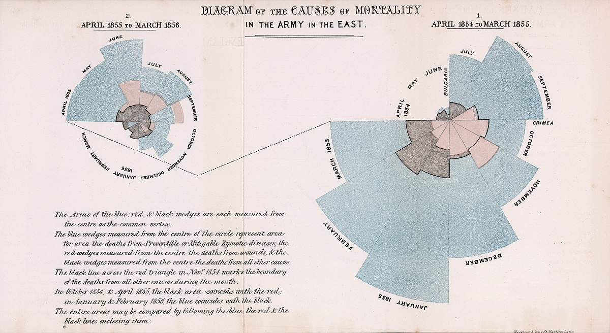
Let's try and read this chart. Nightingale had data showing how soldiers were dying from three main causes: preventable diseases, war wounds, and other causes (like accidents or natural causes).
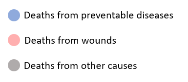
She wanted to highlight that far more soldiers were dying from preventable diseases—things like cholera, typhus, and dysentery—than from war injuries. So the military could save countless lives by focusing on sanitation and disease prevention.
The chart divides each segment into three parts, with different colours representing different causes of death. If you looked at the red segments (deaths from war wounds), you might expect them to dominate the chart because the soldiers were in a war. But most months, the blue segments (deaths from preventable diseases) were shockingly much bigger. The key feature of the chart was that the size of each coloured segment grew based on the number of deaths in each category. This means the bigger the segment, the more people died from that cause in that month.
One of the key advantages of a Coxcomb chart is that it’s visually striking and makes patterns easy to identify, especially when there’s a clear difference between categories. This visual appeal makes it great for storytelling with data, which was exactly what Nightingale intended—using data to drive action.
Now let's make our own version in Tableau.
Making a CoxComb Chart in Tableau
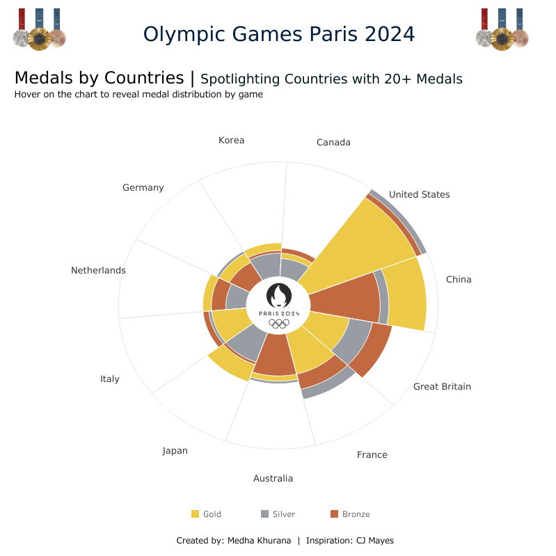
Creating a Coxcomb Chart in Tableau can be quite challenging due to the complex mathematical calculations involved, and there’s no straightforward way to do it. However, thanks to the incredible Tableau community, individuals like CJ Mayes have made the process of building complex charts like CoxComb much easier by sharing their work. CJ not only shared his stunning Coxcomb Chart templates but also broke down the complex math and logic behind them in a way that’s easy to follow.


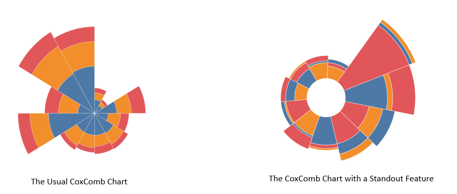
His templates go beyond functionality—they elevate the design, enabling others to craft unique, visually engaging charts that grab attention and tell a story. I used his second template to create a CoxComb on my own which was a standout for two reasons:
- It was entirely designed within Tableau.
- Unlike traditional Coxcomb charts that start from the centre, this one had an image placed in the middle, making it more visually appealing and unique.
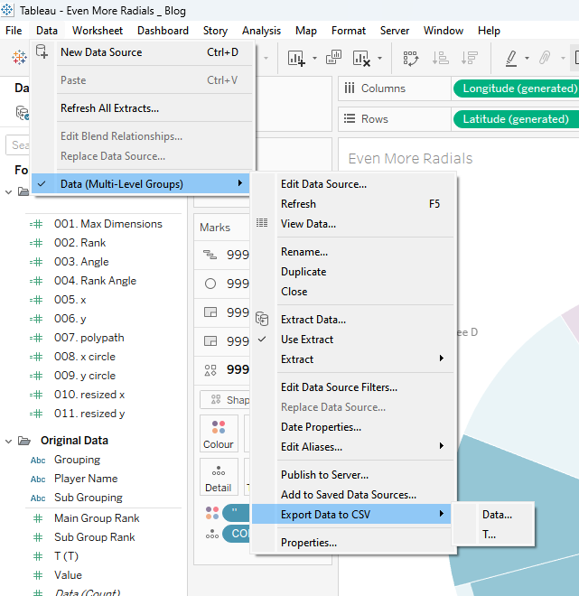
To use CJ's template, I first downloaded it from his Tableau Public page, then clicked on the data and exported the two data files as CSVs.
Next, I grabbed the Paris Olympic Data 2024 from Kaggle, which I wanted to analyze. The goal was to rebuild the template using the Olympic data, focusing on visualizing the number of medals won by each country, split by category, during the Paris 2024 Olympics. I also applied a filter to include only those countries that won more than 20 medals overall, ensuring the data was focused on top-performing nations.
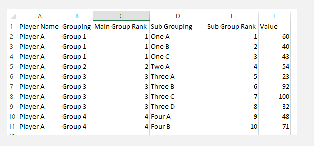
In CJ's original template, the full Coxcomb represents one player, 'Player A' (a single category). Player A was part of four groups, and within each group, Player A played different games represented by Sub-Groups (segments). The scores for each game were listed in the Value column.
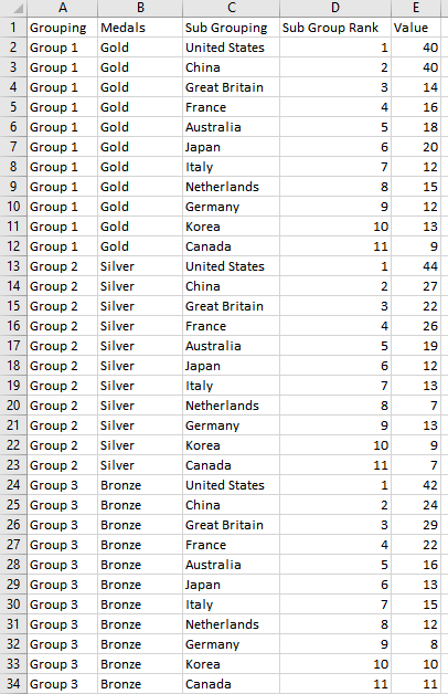
For my case, I adapted the structure as follows:
- The "player" is now Medals, representing the three categories: Gold, Silver, and Bronze.
- The Sub-Groups are now Countries, with each segment of the Coxcomb representing a different country.
- The Value column corresponds to the number of medals each country won in the Paris 2024 Olympics.
It's important to note that values should be between 0 and 100. If your data exceeds this range, you'll need to normalize the values to fit within it for proper visualization.
Next comes the other data source—the crucial one that we do not need to modify. This data contains a column labelled T, with values ranging from 1 to 24.

Now, you might wonder—why just 1 to 24? Was 24 CJ’s lucky number? (Haha, who knows!) But, in fact, this forms the basis of the curves you see in each segment of the Coxcomb. The values from 1 to 12 represent the outer curve, while 13 to 24 create the inner curve. This is made possible through the 007. Polypath Calculation which looks like this:
if [T (T)] <= 12 then [T (T)] else – [T (T)] end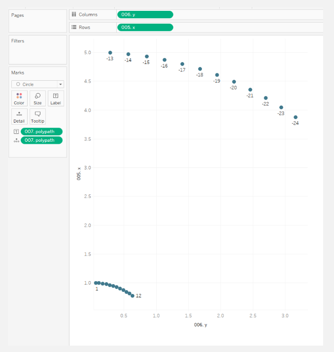
As CJ mentioned in his blog, it’s best not to mess with the T file—but let’s experiment a little and see what happens if we play with it.
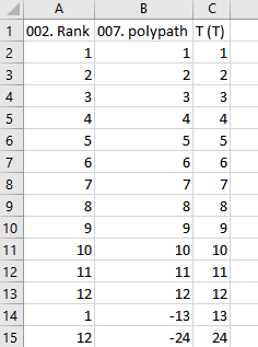
For instance, if we remove points from 14 to 23 and refresh the data source, the results are interesting. Instead of the smooth curves we typically see, you’ll notice that the outer points are now directly connected, forming straight lines rather than an arch.
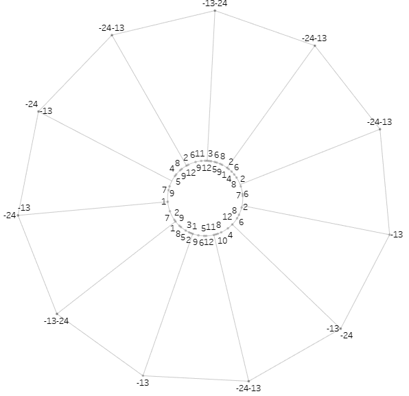
This shows that the values in the T column represent the points that form the circular shape of the Coxcomb chart. The more points you have, the smoother the curves will be.
I’m not going into every calculation or step here since CJ has already explained those in detail in his blog. I have only focused on key adjustments I made to suit my visualization.
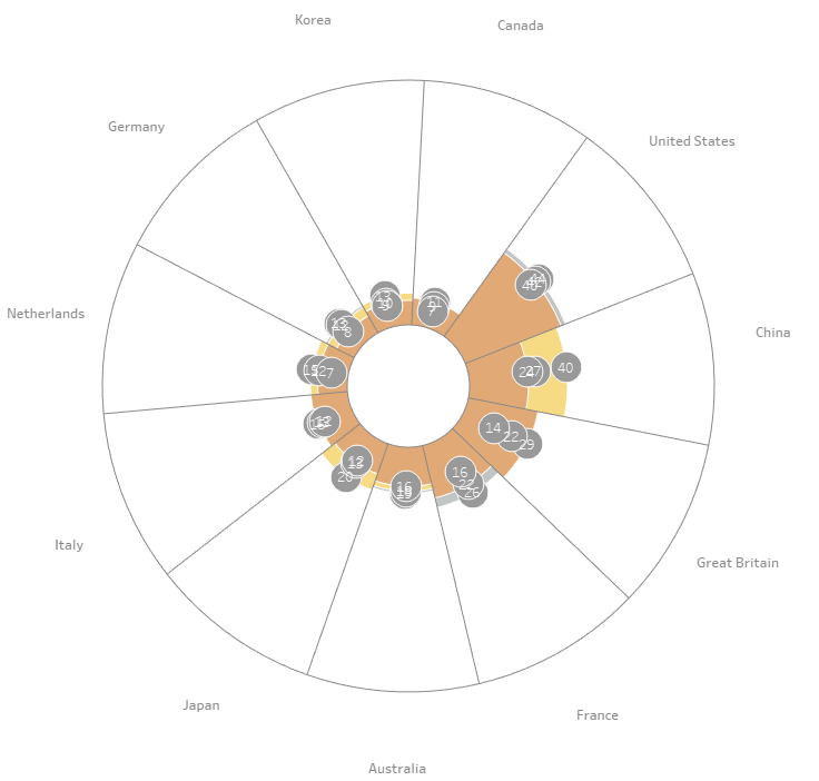
Following CJ's blog, I was able to progress to the stage where the visualization was nearly complete. However, if you look closely, the US won 40 gold, 44 silver, and 42 bronze medals but the gold layer is not visible for the US because it’s completely overlapped by the bronze and silver layers. Similarly, Canada won 9 gold, 7 silver, and 11 bronze medals, and here the bronze layer has fully overlapped the gold and silver.
To fix this, I needed a way to sort the segments to ensure the smallest segment came first and the largest segment came last.
Sort Categories in each Segment
To achieve the desired result, we need to introduce a new column in our data called 'Sort', which simply ranks the categories within each segment.
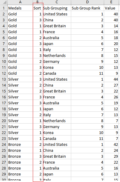
Next, we create a calculated field called 'Concat', where we concatenate the Sort and Sub Grouping columns using the following formula:
[Sub Grouping] + Str([Sort])Now follow the below steps:
- Hide map layer MP. Value because we don't need the values in circles.
- In the MP. Chart Layer, Drag and Drop Concat in details and move it to top.
- Move the Layer MP.Chart above the layer MP. 100% Ring for the tooltips to show on each segment.
Source: Author
This gives us a nicely organized and sorted view of each segment. We’re almost there!
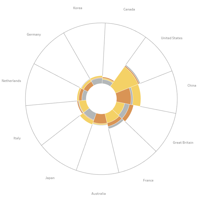
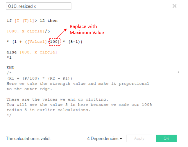
Now, the highest value in my dataset is 44 (for the US medals). Ideally, I want this maximum value to extend all the way to the edge of the outer circle. To make this happen, we need to tweak two key calculations—010. resized x and 011. resized y—by replacing 100 with the maximum value in our data.
Updating these two calculations gives us the final look for the Coxcomb Chart.
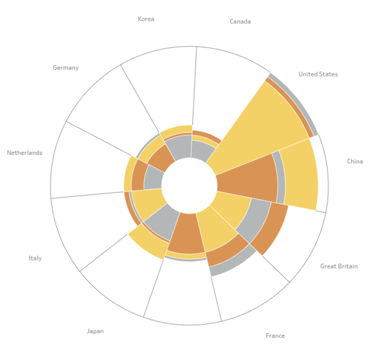
Finally, a few formatting tweaks, and we can add the Olympics logo in the centre for a polished finish!
Trying a few other alternatives!
Let's play with the template a bit more.
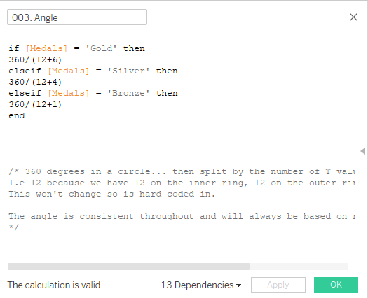
A colleague suggested adjusting the angles to make the overlap of categories more evident within each segment. To do this, we’ll make some changes to the 003. Angle calculation.
Currently the angle calculation is set to 360/(12-1). This formula divides the circle into equal angles based on the T value (12 on the inner ring and 12 on the outer ring).
Let’s tweak these angles slightly based on the type of medal. After making this adjustment, drag 'Concat' below Medals in the Marks section.
Also, hide the outer 100% ring map layer.
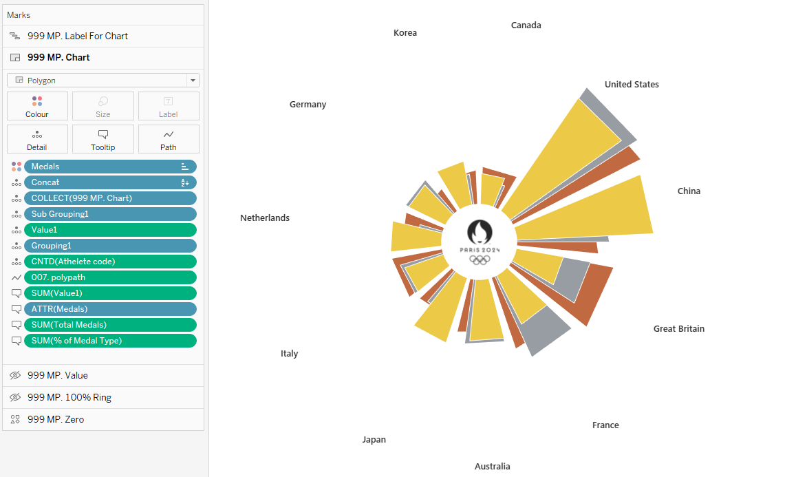
Now the first category is always gold, followed by silver, followed by bronze.
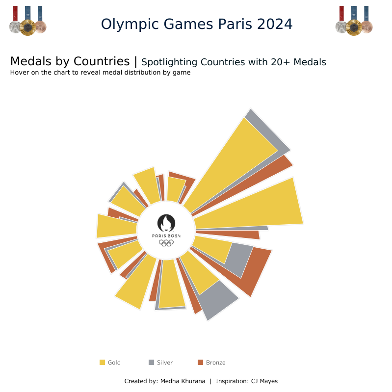
The result? We’ve created a completely new version of the Coxcomb Chart, where each category overlaps in a way that resembles an Olympic Torch! 😉
Here is the final look.
Closing
To truly upskill, it’s invaluable to learn from those around you. Unique visualizations like this one spark creativity and inspire fresh ideas and I truly enjoyed creating this.
Special Mention
I want to extend my heartfelt gratitude to CJ Mayes for his willingness to explain how to build this visualisation using his template and navigate the more challenging aspects, like sorting the segments, during our call. His excellent explanation made the process so much easier.


